
The Blueprint to Typography: T&C's to Type
- Faris H

- Apr 2, 2020
- 2 min read
The fundamental concepts and terminology of typography design – in words you can understand. Typography configuration is the workmanship and strategy of orchestrating type. It's at the focal point of a creator's range of abilities and is about considerably more than just creation the words neat. The typeface you pick and how it functions with your format, lattice, shading plan, etc will have the effect between a decent, awful and incredible structure.
Font selection
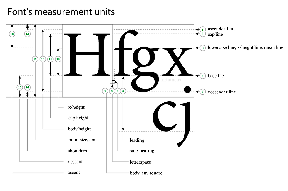
Textual style configuration is a long and included procedure. Typefaces are made by craftspeople over a considerable timeframe, utilising ability sharpened over numerous years. The best, expertly structured text styles accompany different loads and styles to frame a total family, in addition to deliberately considered kerning sets, multi-language support with worldwide characters and expressive substitute glyphs to change up typesetting. The two most important qualities that your text should have are a readable font, and high contrast. Many sites today choose a sans-serif font such as Arial, Verdana, or Helvetica as their base font because they are familiar and very easy to read on screens. They also come standard, so by choosing fonts such as these, you can be sure that the text will visually be the same on every screen. Contrast is also very important. If the background is a dark colour, such as black or deep blue or green, make sure to use a very light font colour such as white, or a light version of another colour that compliments the background. Neon colours or colours that are similar in saturation or brightness are generally not a good idea to use, since they can make the text difficult to read. The best practices for creating contrast that is visible to visitors have this vision deficiency.

Size
All typefaces are not created equal. Some are fat and wide; some are thin and narrow. So words set in different typefaces can take up a very different amount of space on the page. Understanding your audience is critical to selecting a font. If you audience is likely to be wearing corrective lenses it is probably not a good idea to use a small font for large blocks of text. At the end of the day everything is relative. Words presented in larger font size are considered more memorable and rated with higher judgments of learning. One explanation for this phenomenon is that people believe that font size affects memory. However, it is not clear why people hold this belief. One alternative is that font size represents importance, with larger fonts implying more relevant information. More important information is judged as more memorable and is, in fact, better remembered.
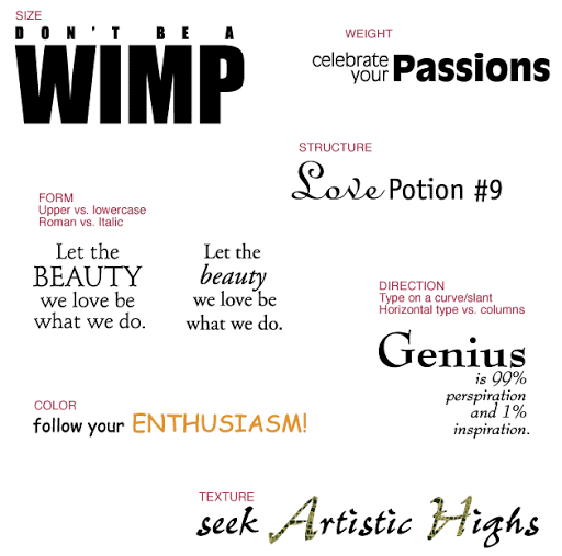
Hierarchy and scale
If all the type within a layout looks the same, it's difficult to know which is the most important information. Size is one key way in which typographers create hierarchy and guide their readers. Headings are usually large, sub-headings are smaller, and body type is smaller still.
Size is not the only way to define hierarchy, it can also be achieved with colour, spacing and weight.


Comments