
The Professional Game: Flying with Flyers
- Faris H

- Feb 20, 2020
- 2 min read
Updated: May 26, 2020
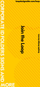
Crafting the perfect marketing material can be very demanding and stressful. Regardless the outcomes of print design will always have opinionated views. Features such as high contrast visuals are easy to glance and can be attention grabbing. Whereas, emphasis on key words can be a subtle way of grabbing attention without colours clashing creating a distinct focal point to the material been shown. As a result, with the development of the flyers, our group discussions and feedback sessions had caused us to take into account the importance of negative space. The first outcomes of flyers had minimal space between them and was quite messy in structure and had no hierarchy of type. Due to this we decided the design should scale appropriately our hands and decrease in size. The in turn allowed further development to divide focus on not only key words but also for prominent colours. Incorporating brand visuals, colours, fonts and overall design style to the flyer so that users familiarise with the studio. Below are showcased the promotional flyers for Loop Designs.
Here below are the foundations of the flyer designs. That being said after consultations and feedback multiple adjustments were made.


These are the second stage of flyer design development, after extensive feedback and positive meetings this concept was agreed to be further developed and was an improvement on the previous stages before it. Colour preferences are deeply rooted emotional responses that seem to lack any rational basis, yet the powerful influence of colour rules our choices in everything from the food we eat and the clothes we wear to the cars we buy. In result of this thesis The colour pink was chosen due to its association being the universal colour of love for oneself and of others.


These were the final developments as a variety of structures and layouts were established. From Incorporating brand visuals, colours, fonts and overall design style to the flyer so that users familiarise with the studio.


Comments